NOLAN THOMPSON
Context
Problem
Solution
Timeline & Role
I have led research, design, and development efforts for CMOVF, working closer with the client since Spring 2024.
Spring 2024
As the lead UX designer, I crafted the visual identity of the platform, conducted initial research and roadmapping, as well as designing MVP prototypes.
Fall 2024 - Summer 2025
As the product owner, I collaborated closely with the client and oversaw multiple student teams to continue design and development iteration, navigating policy, complex feature scoping, and usability testing.
Fall 2025
Currently working to officially launch, stay tuned!
Client Testimony
"Bringing both a strong knowledge base in graphic design, especially applied to SE design, as well as repertoire of effective interpersonal and management skills, Nolan has been a central figure in the success of the CMOVF project – culminating in the April 2025 milestone development of a CMOVF working prototype. CMOVF now moves to an online launch to be put for trail use by researchers and clinicians internationally."
- Dr. Vinoth Jagaroo, main client & cognitive neuroscientist.
My Prototypes & Design Work

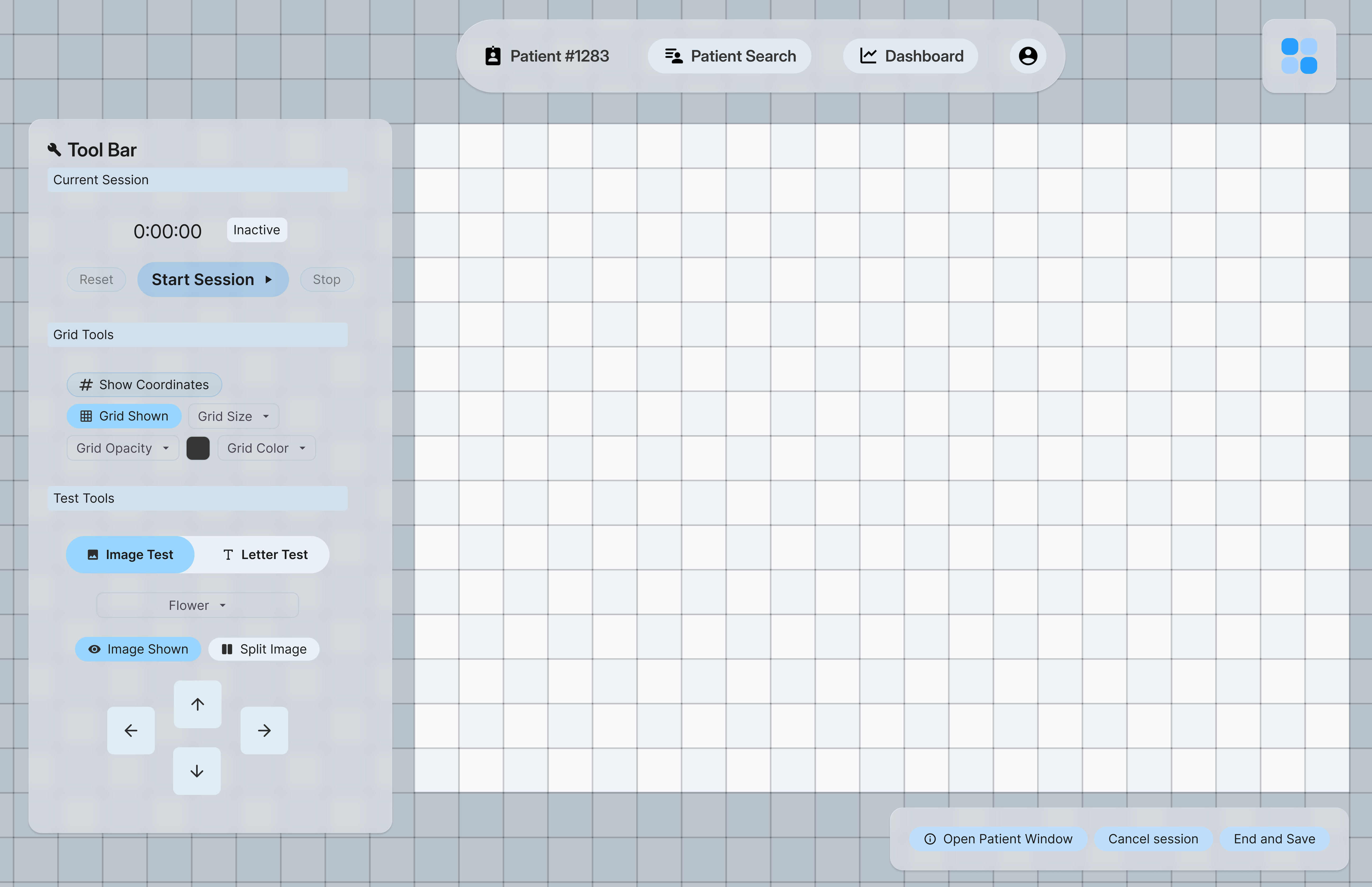
Testing Interface: Form-First
Testing is intentionally isolated from the main site map to prevent accidental navigation and ensure patient-specific accuracy.
Strong guardrails prevent premature exits and test interruption with explicit warnings and confirmations.
Clear hierarchy across labels, active states, inactive controls, and tool groups supports highly accurate clinician workflows.
Designed as the primary working surface: large controls, structured toolsets, and patient context persist throughout the session.

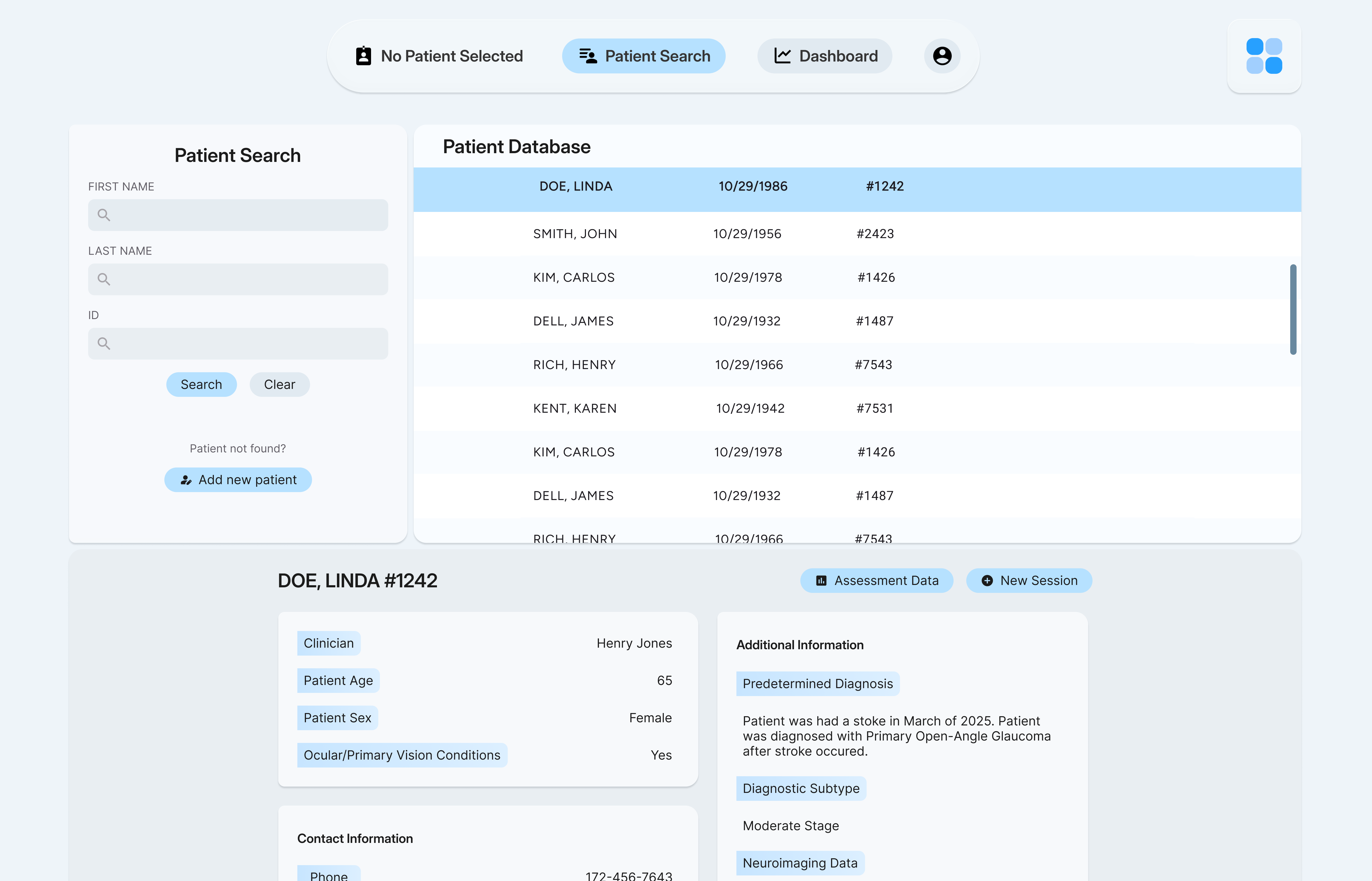
Clinician-facing dashboard: Efficiency
Everything lives on one page—search, database, patient details, and test initiation—minimizing time spent navigating.
Testing mode is only accessible on patient details widget, helping prevent critical patient-assignment mistakes.
Flexible text fields support varied clinician and researcher notes rather than forcing rigid EHR-style structures.
Built directly from clinician research to include only the fields and actions required for visuospatial assessment workflows.

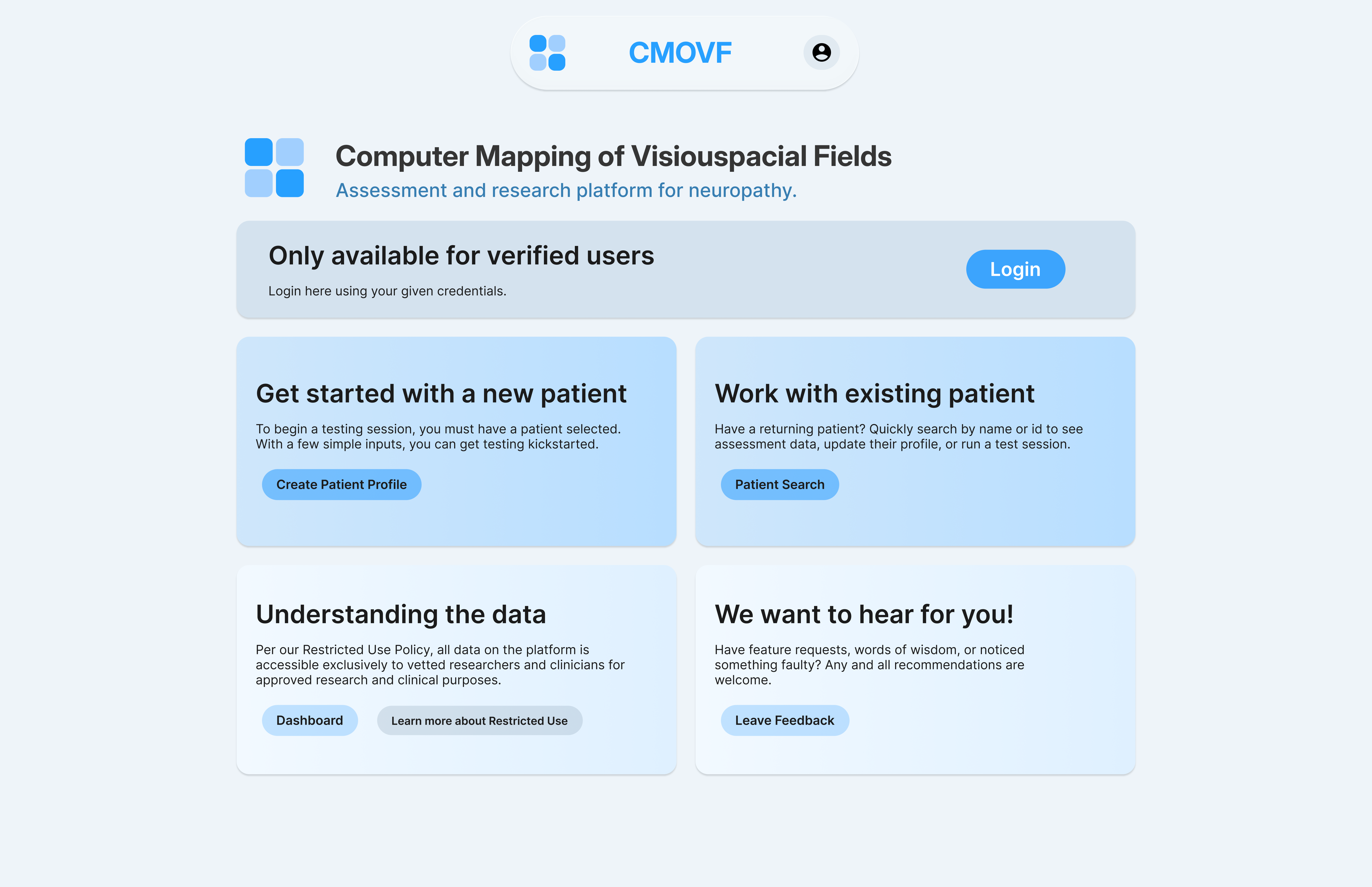
Landing Page: Trust & Transparency
Prioritizes clinician trust through clear hierarchy, transparent policies, and explicit direction before login.
Soft medical-blue palette, refined typography, and generous spacing create a calm, credible, research-grade visual language.
CTA structure is behavior-driven: new patient, existing patient, data dashboard, and feedback all separated to prevent mis-clicks.
A dark, high-contrast visual language supports long study sessions, reduces visual fatigue, and aligns with the brand’s “serious but inviting” tone.
Insights
As the first designer to shape this platform from the ground up, the project required rapid immersion into a clinical domain that was initially unfamiliar. Early discussions with clinicians and researchers revealed that the core challenges were less technical and more operational—misaligned workflows, unclear data structures, and outdated tools for visuospatial assessment. User interviews quickly surfaced a clear problem space, demonstrating that deep expertise wasn’t a prerequisite; structured research and active listening were.
A significant portion of the early discovery centered on understanding HIPAA, restricted-use guidelines, and the implications of handling sensitive patient data. These constraints reshaped the information architecture, permission models, and technical direction of the platform. What began as an Electron-native concept evolved into a fully web-based system once hosting, data handling, and access-control requirements became clear. Although the platform is limited to verified users, privacy remained a core design driver. Authentication flows, visibility rules, and data minimization strategies were built intentionally to ensure that only essential patient information is surfaced at any given time. These insights established the foundation for both the UX direction and the long-term scalability of the tool.
Outcomes
The finalized visual identity, toolbar logic, and site architecture I designed formed a durable framework that guided all subsequent development stages. Much of the current product experience still reflects the initial design system and interaction patterns established during early prototyping, validating the strength and clarity of the foundational work. The platform has since gained significant attention across the clinical community. The client has been invited to present the tool at multiple national conferences, generating interest among clinicians and researchers seeking modernized approaches to visuospatial field assessment. The project now stands as an early, credible example of how thoughtful UX and rigorous research can modernize legacy clinical workflows.