NOLAN THOMPSON

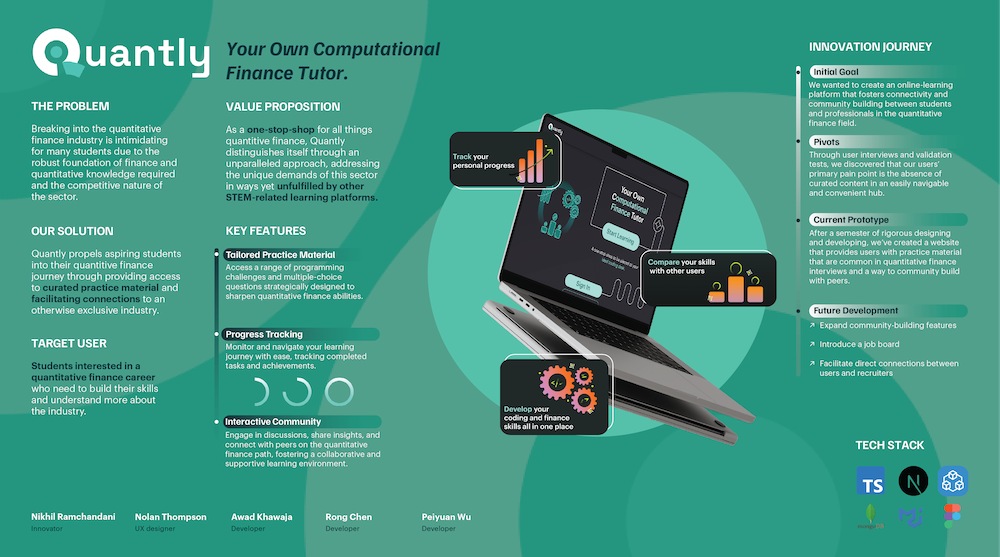
Problem
Solution
Timeline
Spring 2024 → Accepted into Launch Labs, a startup accelerator, to take a beta version to market.
My Role
- Branding → Designed the logo and overall visual identity of Quantly.
- User Research → Led the team through user research from ideation to testing.
- UX/UI Design → Single-handedly designed all screens.
- Front-end development → Got my hands dirty in the development process, making sure design details were implemented correctly.
Design Strategy
The visual identity of Quantly is straightforward, slick, and warmly confident. Our main users, computer science and finance students, aren't interested in design clutter, and often express slight indifference to design choices. That is where our design strategy excels. The design quietly yet confidently uplifts functionality. It is friendly enough to be intuitive and encouraging, but straightforward enough to reflect a 'no bluff' commitment to content.

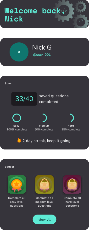
Easy to navigate, filter, and customize
The question list is the core of the learner flow, so the layout prioritizes scannability, clear hierarchy, and fast filtering and search methods built from heuristics and user research.
Encouraging and focused, not overwhelming
The interface has accents of excitement and visual detail to feel alive, but stripped of unnecessary distractions, dense text, or busy visualizations.
Supportive for new users
A small tips widget provides contextual guidance on how to use filters, understand question metadata, and build effective practice sessions. Removable after early onboarding.
Built for contribution from day one
A prominent “+” button lets learners submit their own questions, which was critical to the MVP as we were actively growing the question database.

Flexible layout with expandable native IDE
The interface allows learners to expand and collapse the embedded IDE, giving them full control over how much space they need for code, questions, or explanations. This flexibility supports different learning styles and keeps cognitive load low.
Built-in discussion panel designed for learning integrity
Learners can discuss questions with peers directly inside the interface, but the discussion panel remains hidden by default to prevent unintentional spoilers. This maintains motivation, preserves problem-solving integrity, and still gives access to community when needed.
Interactive test cases
Test cases update dynamically as learners code, helping them validate their reasoning in real time. These interactive checks reinforce understanding, reduce frustration, and encourage experimentation throughout the learning flow.
Sleek, dark-mode first
A dark, high-contrast visual language supports long study sessions, reduces visual fatigue, and aligns with the brand’s “serious but inviting” tone.
Landing Page Design
The landing page diverts from dark mode as a way of inviting all types of users in. It is a lighter and fresher Quantly waving a warm hello!
Motivate Learners
Balance Visuals
Create Confidence
Bespoke Meets Invisible UI
Research
Hypothesis
As a student wanting to pursue a career in quantitative finance, I want a centralized hub containing reliable practice questions, means of managing and proving my skills, and industry insights so that I can more easily improve my job readiness.
Process
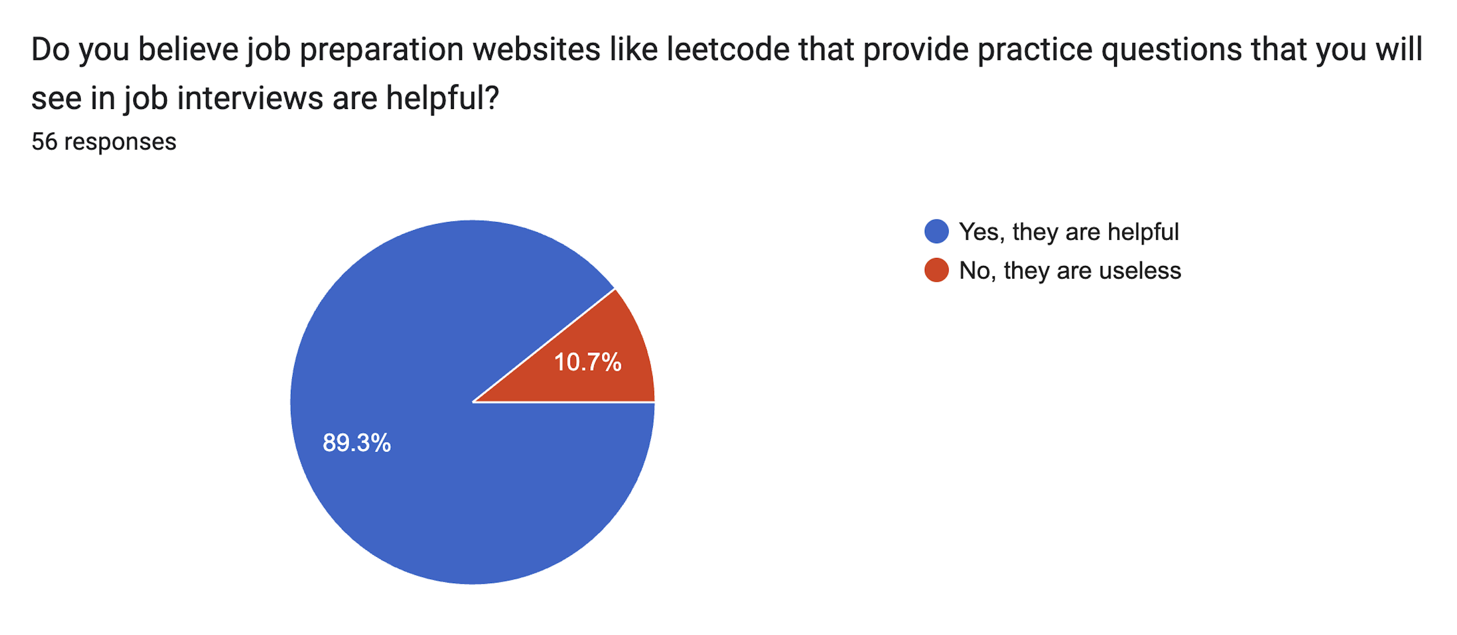
Feature validation experiment gathering input from 56 responders via survey. Pre-development, we launched this survey to do a pulse check on our core features, with an impressive 87% of responders expressing interest in features across the board.
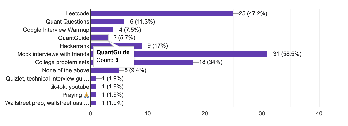
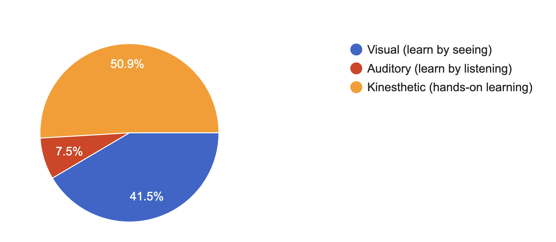
Product Analysis gathering input from 53 responders via survey. After confirming the success of our core features through prior testing, this gav our team insight into what to build next and how to better fit our users' learning styles.
Structured one-on-one interviews throughout three main stages of development: problem, solution, and usability testing.
Jobs
Confirmed students are actively trying to prepare for quant finance roles by studying technical and behavioral content. They network, prepare portfolios, and seek relevant resources wherever they can.
Pains
Many face scattered resources, unclear interview expectations, and lack of consistent support. Limited insider networks or referrals create additional barriers.
Gains
They want centralized prep tools and relatable career guidance. They also value a motivating network that makes quant finance feel achievable.
Usability Testing
Utilized the Single Ease Question (SEQ) method developed by measuringU which asks users to rank an observed task on ease of completion. In total, our chosen tasks averaged around a 6 total score out of 7, a great result for our first iteration of the product.
Informing Our Design Strategy
Our research played a major role in ensuring features aligned with user needs. However, what proved even more vital to our design strategy was understanding the underlying feelings of confusion and burnout users experienced throughout their journeys. This insight led us to realize our design gold standard wasn't just functional and frictionless, it needed to motivate.
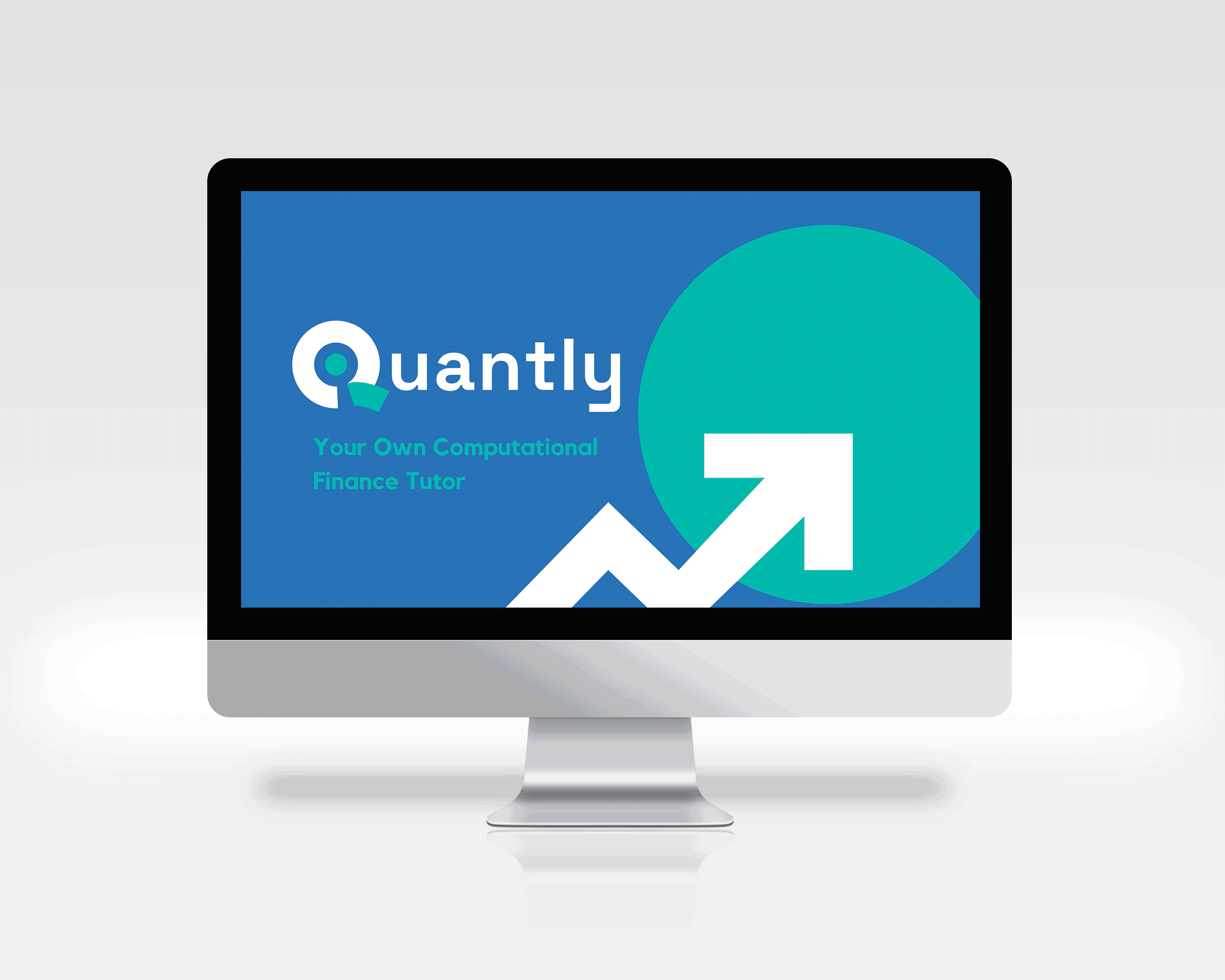
The founder first came to me with his vision of Quantly and this logo. I am extremely proud of my role in the growth of Quantly's visual identity.